OpteconSolutions is a Toronto-based Startups and SME management consultancy. Our mission is to enable business transformation by providing our expertise in strategy, technology, and management. We love working with young entrepreneurs, solving problems of all shapes and sizes. When working with SMEs, our unique, cross-functional experience and expertise allows us to partner with clients to identify their pain points, offer analytics-based solutions and innovate their business operations.
Challange
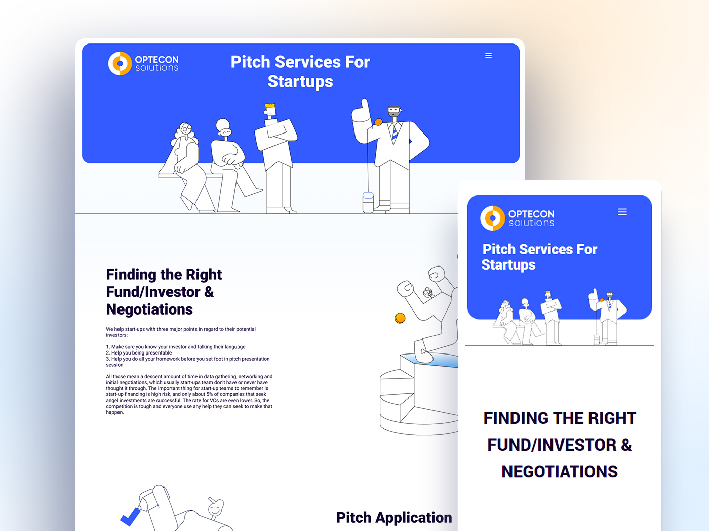
It was all about grabbing the attention of the audience. People who have started a start-up and are looking to expand that, or those who are starting out and seek support and advice to grow it, or those who intend to immigrate to Canada and have the means to do so are all considered Opticans’ users. First, we need to gain their trust. A relevant and easy user journey should be provided, as well as information that is categorized and organized.
CATEGORY: UI/UX
My Roles: Website design,User research, Persona Creation, Character design, Motion design, Style Guide
Dates: 2021
Solution
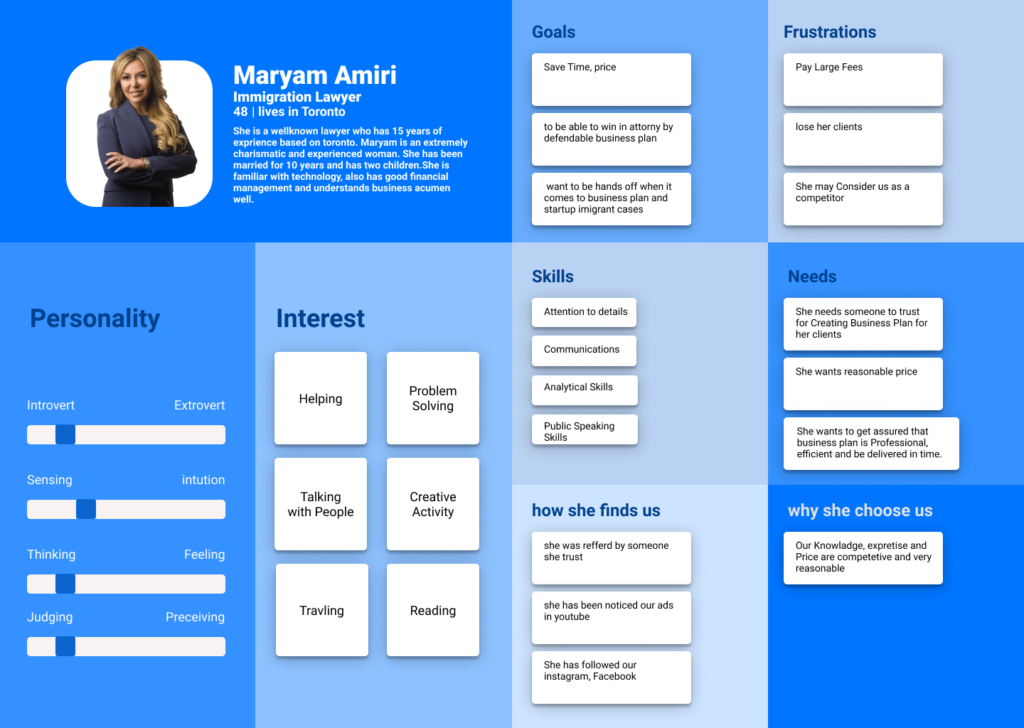
I am always looking for the most effective solution to matters I come across. I relied on the aesthetic law of design to establish trust. In a nutshell, the aesthetic law says that users perceive more usable designs as aesthetically pleasing. To begin with, I had to identify my main personas. Therefore, I came up with two types of personas based on ethnographic research. I have worked in high tech startups for the past 10 years, so I have a general idea about my target market. The aforesaid research showed that I wasn’t wrong about their attitudes, likes, or dislikes.
My intention was to convey my message by using characters in order to influence the audience’s feelings. In turn, this breaks the ice between users and Optecon and creates empathy. Based on my experience, cartoonish characters are loved by people because they show vivid and clear expressions. Having said that, by hovering over some characters, you can give them a slight animation, which would give them an interactive and live feel for users. At the beginning, I met with the owners several times. To find anything behind the user’s face, their initial idea was to create a minimal environment. This is why I chose to use wide empty spaces and line drawings. Here, less is definitely more.
What I Learned
Despite the fact that it is an informative website, I didn’t consider the problems that may arise in mobile versions due to no hover state. Therefore, I had some trouble displaying the items correctly on different devices. I thought loopable actions would be appropriate for some elements. Following a usability test with real users, we came to the conclusion that people are fine with static images. Furthermore, owners wanted users to navigate into P2P conversations, so we designed a floating button (set appointment) to do so. As a result of another test we conducted, it appeared that their p2p appointments had significantly increased by about 45%. To come up with a solution for any individual case, it only takes one effort & close attention.